Uncategorized
Gaming Posters That Finish a Setup Cleanly
Jul
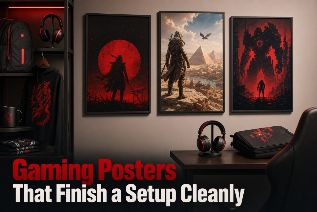
gaming poster choices look clean when they do one job well: they connect your setup, wall size, and game identity without fighting for attention. Most bad picks are not bad art, they are bad fit. A strong poster can pull keyboard lighting, desk gear, and room color into one visual lane, while a weak one makes even good gear look random. If you are comparing options, the real test is simple: scale, finish, palette, and message all need to support the room instead of shouting over it.
Why do some gaming posters make a setup look sharper than others?
The posters that sharpen a setup are the ones with visual discipline, not just loud game branding. Clean setups usually rely on one dominant style, one controlled color palette, and one clear focal point. If the art has too many competing characters, effects, fonts, and saturated colors, the wall starts to feel like a feed of mismatched thumbnails instead of part of the room. That is why some prints instantly look premium while others feel cheap even before you notice the paper.
A good buying shortcut is to check what the poster is doing from two distances. Up close, the print should reward detail. From across the room, it should still read as one intentional shape or scene. If the image only works when your face is near it, it will not anchor the room well. If it turns into a noisy blur from the desk, it is better as novelty art than as everyday decor.
- Minimal silhouette art gives a cleaner, more mature mood and works well beside RGB-heavy setups.
- Character splash art creates energy, but needs more empty wall around it so the room does not feel packed.
- Text-based in-joke posters land best when the phrase is the hero and the background stays restrained.
- High-contrast competitive visuals suit sharper setups with black, white, steel, or red accents.
How the art style changes the mood
Art style sets the room faster than the subject does. A cel-shaded or comic look feels playful, a dark cinematic render feels serious, and a flat graphic design feels deliberate and modern. That is why a joke print can still look polished if the composition is tight. For a more style-first approach, Gaming Home Decor That Feels Like Your Rank is useful because it frames decor around identity, not just fandom.
Why color balance matters beside your gear
Color balance matters because the poster will sit next to monitors, LEDs, mouse pads, and often a chair with its own accent color. The easiest win is repetition. If your setup already leans black and cyan, black and purple, or neutral gray with one bright accent, choose art that repeats those tones instead of introducing three new ones. A poster does not need to match perfectly, but it should rhyme with the gear.
When a poster should be the focal point
A poster should be the focal point only when the wall is relatively empty and the desk area is visually calm. If you already have shelves, acoustic panels, a neon sign, or a gallery of smaller pieces, the poster should play support instead. One hero piece beats five almost-hero pieces every time. That decision alone separates intentional gamer wall decor from clutter.
What should you look for in a gaming poster? Look for four things: art that matches your setup mood, a size that fits the wall without swallowing it, a finish that handles room lighting well, and a design that signals your game identity clearly without crowding the rest of the room.
What size and layout work best for your wall?
The best size is the one that leaves breathing room around the art. Posters look strongest when they occupy enough wall to feel deliberate but not so much that edges crash into furniture, shelves, or corners. As a rule of judgment, compare the print to the object beneath it. Over a desk or bed, the poster should feel visually related to that width, not like a tiny sticker floating above it or a slab hanging past the furniture line.
Single poster versus grouped prints
A single poster works best when the artwork is strong enough to carry the wall alone. Grouped prints work better when each piece is simpler and the set creates the impact together. If you are buying one dramatic image, go single. If you want to represent several roles, champions, or game references, a group keeps each piece readable without forcing one overloaded design to do everything.
Matching size to desk, bed, or open wall space
Desk walls usually want tighter proportions because monitors already take visual space. Bed walls can handle broader art because the furniture sits lower and leaves more uninterrupted area. Open walls near a corner gaming station can support either a large centerpiece or a staggered pair, but only if you keep clear margins from switches, shelves, and cable channels. Before buying, tape the dimensions on the wall. That low-tech check prevents most scale mistakes.
How orientation changes the overall look
Portrait posters add height and work well beside a monitor stack, tower shelf, or narrow wall strip. Landscape posters calm a room because they echo the horizontal line of desks and ultrawide screens. Square formats feel modern and balanced, but they need enough blank wall around them to avoid looking boxed in. If your room already has many vertical lines, such as shelving and curtains, a horizontal print often creates better balance.
- Choose one large poster if the wall is mostly empty and you want a focal point.
- Choose two matching prints if you want symmetry over a desk or bed.
- Choose a three-piece layout only if the spacing can stay consistent and the art style is unified.
- Skip oversized art if the wall also carries shelves, LED strips, or collectibles.
If the room already has several statement items, compare your wall plan with Gaming Room Decor That Feels Competitive, Not Messy. The same principle applies here: the cleaner the visual hierarchy, the more expensive the room looks.
Which materials and finishes hold up best in a gaming room?
Matte, heavier-stock posters usually hold up best in gaming rooms because they control glare and look more refined under mixed lighting. A gaming setup rarely has one simple light source. You have monitor glow, LEDs, ceiling light, maybe daylight from one side. That environment exposes cheap paper fast. Thin stock curls more easily, shows handling marks sooner, and can make dark scenes look muddy if the print quality is weak.
Paper weight and print clarity
Heavier poster material matters because it hangs flatter, resists edge warping better, and makes blacks look denser. Print clarity is just as important. Fine text, sharp line work, and dark gradients reveal weak printing immediately. In character art, look at the eyes, armor edges, and shadow transitions. In text-based designs, inspect letter edges. Fuzzy outlines usually mean the file or print process was not strong enough.
Matte versus glossy finishes
Matte is the safer choice for most setups. It diffuses reflections, hides fingerprints better, and keeps the image readable under RGB strips and monitor spill. Glossy can make colors pop, but it also catches every light source in the room. If the poster will face a window, glossy is usually the wrong call. If the room is dim and controlled, glossy can work for bold arcade-style art with bright contrast.
When framing is worth the extra cost
Framing is worth paying for when the print is large, the room gets dust or humidity, or you want the poster to read more like art than merch. A frame adds structure, protects edges, and makes even simple designs feel finished. Unframed posters can still work, especially for a more casual setup, but they depend much more on perfect hanging and better wall spacing.
- Choose matte for RGB rooms, side lighting, and darker artwork.
- Choose glossy only when you want punchy color and can control reflections.
- Choose framed for long-term display, giftability, or larger statement pieces.
- Choose unframed for lighter, easier-to-swap seasonal or mood-based wall changes.
If you are comparing a poster with other setup upgrades, Which Gaming Accessory Deals Are Worth It for Your Setup? helps put decor in the same value conversation as gear, which is the right way to shop for a room that needs cohesion rather than random additions.
What do shoppers usually ask before buying gaming posters?
The most common questions are about room size, framing, and how to combine posters with other decor. The short answer is that posters are flexible, but only if you control scale, reflections, and visual hierarchy. These are not styling details after the fact. They are buying criteria. Get them right before checkout and the room looks intentional from day one.
Can a gaming poster work in a small room?
Yes, a gaming poster can work in a small room if the design is visually simple and the size leaves clear wall around it. Small rooms punish busy art more than large rooms do. One clean poster or two coordinated prints usually works better than a dense gallery wall.
Is it better to buy framed or unframed art?
Framed art is better when you want durability, a more finished look, and less risk of edge wear. Unframed art is better when budget matters, you like to rotate pieces, or you want a more relaxed setup. The right choice depends on permanence, not just price.
How do you mix posters with other wall decor?
Mix posters with other wall decor by giving each category a role. Let the poster carry the message, shelves carry objects, and lighting carry atmosphere. If every item tries to be the star, the wall gets noisy. Keep one dominant piece and let the rest support it.
A practical buying rule is this: start with the wall, not the artwork. Measure the space, note your room’s two main colors, decide whether the poster is the focal point or support piece, then choose finish and framing based on your actual lighting. If a design still fits after those checks, buy it. If it only looks good in the product photo, skip it.
