
Uncategorized
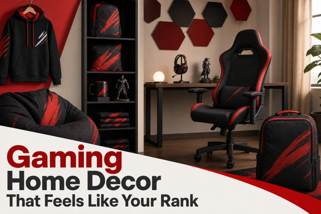
Gaming Home Decor That Feels Like Your Rank
Jul
gaming home decor looks best when it behaves like part of the setup, not like random loot dropped around the room. The fastest way to make a space feel sharper is to match decor to your desk zone, your wall space, and the kind of competitive identity you actually want to show, whether that is a clean ranked grind vibe or a louder meme-heavy look. The payoff is simple: your posters, lighting, and small accents start reading as intentional design instead of leftover merch.
Why does gaming home decor work best when it matches your setup?
Gaming decor works best when the setup leads and the decor supports it, because the desk is the visual anchor in almost every gamer room. If your wall art, lighting, and accessories ignore monitor size, chair position, and walking space, the room feels split into unrelated zones. Good room-fit means the biggest decor pieces repeat the setup’s lines, colors, or attitude so the eye reads one clear scene instead of several competing ones.
What should you look for in gaming home decor?
- Choose pieces that fit the wall and furniture scale, not just the design you like.
- Repeat two or three colors already present in the setup.
- Let one focal point lead, usually a poster, flag, or shelf wall.
- Keep desk accessories low-profile so they do not crowd the play area.
- Use references from one competitive gaming lane or one game universe.
How room size changes what looks balanced
Small rooms need fewer, larger decisions, not more tiny ones. One medium statement piece above the desk usually looks cleaner than six small prints scattered around corners. In a larger room, empty wall space can swallow a single poster, so you need either a wider frame, a grouped arrangement, or a second visual anchor on another wall.
The common mistake is judging decor by product photos instead of by negative space. A room with a bed, wardrobe, and desk already has heavy visual blocks. Your decor has to balance those blocks, not fight them. That is why a slim vertical print can work beside a shelving unit while a wide banner works better above a monitor setup.
How desk placement affects the rest of the room
Desk placement decides where the room’s focal line starts. If the desk faces the door, the wall behind it becomes the hero shot and deserves the strongest gaming poster or wall piece. If the desk sits side-on, side walls matter more because that is where your eye lands during use and where background visuals show up best in photos or streams.
Lighting follows the same rule. RGB behind monitors supports the desk zone, but ambient light on the opposite wall can make the room feel deeper and less like a glowing corner inside a dark box. Matching decor to desk placement is less about symmetry and more about where attention naturally lands first.
How to keep the theme strong without adding clutter
A strong theme comes from repetition, not quantity. Repeat one game language, one joke style, or one competitive mood across two or three pieces, then stop. For example, a ranked-climb theme can carry through a poster, a desk mat, and one mug without needing every surface to scream the same reference.
If you want a room that feels competitive, not messy, study how focused layouts work in gaming room decor that prioritizes setup flow first. The cleanest rooms usually limit display items to the edges and leave the center functional.
Which decor pieces make the biggest visual difference first?
The pieces that change a room fastest are wall art, desk lighting, and one or two surface accents near the setup. Those elements sit in the main sightlines, so they reshape the room before shelves, figures, or storage boxes ever do. If you are buying in stages, spend first on the biggest visible plane, then on the desk edge, then on soft items that support the palette.
Posters and wall art
Wall pieces do the heaviest lifting because they define tone from across the room. Strong gamer wall art gives the space an identity even when the desk is off. Competitive references work best when they are readable at a glance, like a clean phrase, role-based joke, or iconic symbol, instead of a noisy collage full of tiny details that disappear from normal viewing distance.
Framed prints feel more finished, while flags and unframed posters feel more casual and youthful. Neither is wrong. The choice depends on whether you want the room to read like a styled bedroom, a stream backdrop, or a merch-heavy fan zone. A wall flag such as the Play Wall Flag for Gaming Rooms & Stream Setups works best when you want scale without the visual weight of a frame.
Desk-side accents
Desk-side accents matter because they sit inside your peripheral vision for hours. The best ones are wide and low, not tall and busy. Mouse pads, mugs, headphone stands, and one compact light source can reinforce the theme without stealing usable space. If an item forces you to move your keyboard, speakers, or hands, it is not decor anymore. It is friction.
A custom desk surface can carry more visual identity than three separate trinkets. That is why many setups improve faster with a coordinated mat than with extra shelf clutter. If you are weighing that trade-off, a custom gaming mouse pad often functions as both utility and decor.
Textiles and small display items
Textiles soften the room and stop it from feeling all plastic, metal, and LEDs. A pillow, throw, or chair cover in one supporting color can make hard-edged gaming gear feel integrated with the rest of the room. Small display items should be used as punctuation, not as the sentence. One shelf with two or three meaningful pieces looks curated. Five surfaces covered in mini collectibles look accidental.
How do you choose colors, themes, and game references that still feel clean?
The cleanest gaming rooms usually stick to one dominant color family, one accent color, and one clear reference style. That formula works because gaming setups already contain visual noise from monitors, peripherals, cables, and UI-heavy screens. Decor has to simplify the room, not add another layer of competition. If every item demands attention, none of them actually builds a theme.
Picking a limited color palette
Use the hardware as the base palette first. Black, white, gray, or wood from the desk and monitor arms should count as your neutral field. Then add one main gaming color, such as red, blue, purple, or neon green, and one quieter support tone. This keeps posters, lighting, and textiles connected even when they come from different product lines.
The mistake is buying by character art alone. A brilliant print can still look wrong if its palette clashes with the room’s existing surfaces. If your setup is mostly matte black and cool white lighting, a warm orange poster can work, but only if another object repeats that orange. Otherwise it reads like a separate room was pasted onto the wall.
Using one strong reference instead of many
One strong reference beats five weak ones. A room built around jungler jokes, ranked grind energy, or one game universe feels intentional because all the signals point in the same direction. A room mixing tactical FPS branding, anime neon, retro arcade icons, and unrelated meme slogans usually feels like a shopping cart, not a point of view.
That does not mean every piece must come from the same title. It means the references should share a mood. Competitive gaming references work especially well when they signal role, attitude, or match mentality. If your style leans heavily into one ecosystem, browsing League of Legends merch by wearability and style can help you spot which references feel bold versus which ones feel too literal for a room.
Matching bold designs to the room’s existing tone
Bold designs need quiet surroundings. If the room already has patterned bedding, open shelving, and visible gear, choose cleaner art with stronger typography or fewer focal elements. If the room is plain and minimal, you can afford a louder print or a bigger statement piece because the background gives it room to breathe.
- Minimal room: one bold graphic piece can lead.
- Busy room: choose simpler art with fewer colors.
- Warm furniture tones: use softer reds, creams, or muted greens.
- Cool hardware tones: use blues, purples, grayscale, or crisp white accents.
What do people usually ask before upgrading gaming room decor?
Most shoppers ask the same three questions: can the room still look mature, are posters worth it versus framed prints, and how much decor is enough in a small space. The answer to all three is that fit matters more than hype. Good gaming room decor is not about buying more pieces. It is about choosing the right visual weight for the room you actually have.
Can gaming decor still look mature?
Gaming decor can absolutely look mature when the references are edited and the materials feel deliberate. Typography, monochrome prints, restrained color palettes, and framed pieces usually read older than character-crowded collages or highly saturated novelty graphics. Mature does not mean boring. It means the joke, rank flex, or competitive reference lands without turning the room into a convention booth.
Are posters better than framed prints?
Posters are better for flexibility and scale, while framed prints are better for polish and permanence. A poster suits renters, evolving tastes, and bigger graphic statements at lower commitment. A framed print suits a room that already has a settled palette and cleaner furniture lines. The better choice depends on whether you want to experiment or lock in a finished look.
How much decor is enough for a small room?
A small room usually needs one wall focal point, one desk-level accent, and one soft or functional supporting piece. That is enough to establish identity without shrinking the space visually. Imagine a compact setup with one strong print, a coordinated desk mat, and a mug or pillow repeating the accent color. Beyond that, each extra piece should earn its spot by improving balance, not just adding fandom.
Use this rule before you buy: if a piece does not either anchor a wall, support the desk zone, or repeat the room’s existing palette, skip it. The best setup upgrades are the ones that make the whole room feel more ranked-up, not the ones that merely add more stuff.
